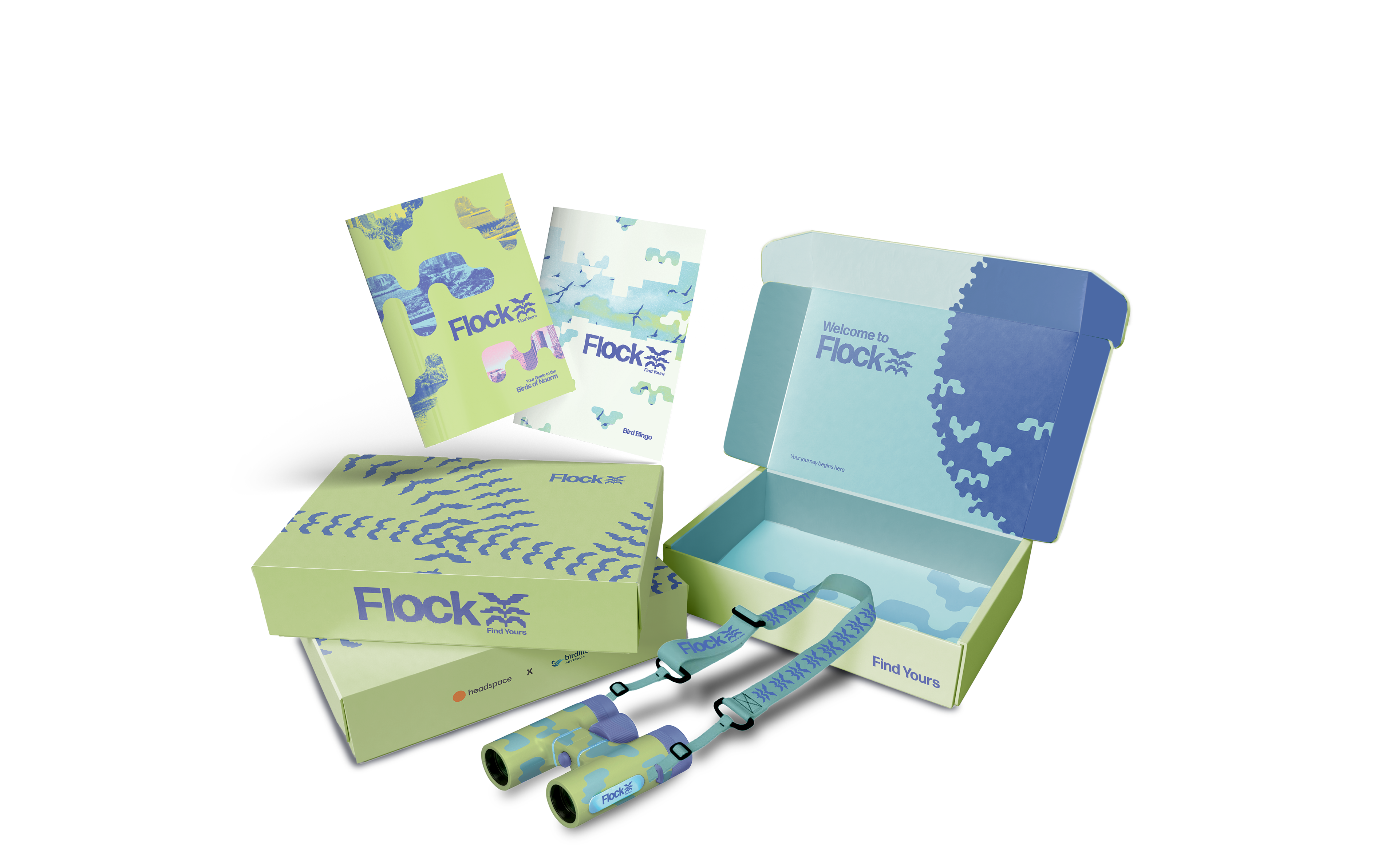

Flock’s logo is inspired by the unique flocking formation of starlings called ‘murmuration’. When starling’s murmurate, they fly in intricate patterns to form a united whirling mass in the sky. The typographic effect on the ‘o’ and ‘c’ mimics this, as though thousands of tiny birds are forming the letters. The pictorial mark complements the type, forming a stack of flocking birds. Stacked together, the birds resemble a sprouting plant—forever growing and flourishing in their community.